- November 7, 2019
- Posted by: Webcap
- Category: website designing services
Responsive website design is one that can easily adapt to the visitor’s viewport. This means it can render easily depending on the size of the skin to make sure that visitors are able to access all the features of the website regardless of where they access from. The real benefit of having a responsive website that can easily load quickly without any distortions or differences in website quality. Visitors don’t have to manually resize the website to gain access to what is in it.
This concept has existed for quite some time but developers have only recently begun to identify its benefits until the advent of mobile devices. During the mid-2000s, mobile devices become more popular and web designers found it difficult to keep websites looking attractive on laptops, mobile phones, and tablets. To achieve this, these designers discovered the importance of flexible layouts. The webpage had to respond to the device of the user.
In recent years, more mobile devices now access websites in comparison to desktops and laptops. This is why it’s important that each website evolves to have this feature. If you fail to pay attention to users of mobile device users, you stand to lose quite a lot of money and reputation. Every company must pay attention to a responsive website to ensure that it can reach a wider audience. So, what are the benefits of a responsive website design?
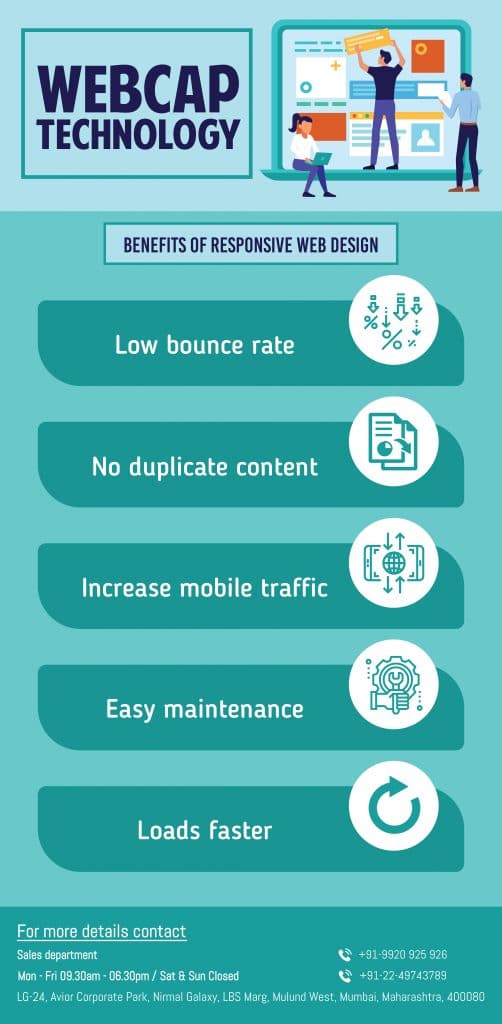
Low Bounce Rate. When your website is optimized to run on mobile devices, chances are high that you provide a better user experience for visitors. This will make them stay longer on the website to explore a lot of its features. They’ll explore other areas of the website.
With an unresponsive website, the visitors find it hard to get engaged on the website and he becomes more likely that they bounce.
Increase in mobile traffic. Nowadays, more than half of website traffic comes from mobile devices. This makes it increasingly important for websites to renders of the small screens of mobile phones and tablets. When you have a responsive web design, it becomes easier for mobile devices to access your website and hence the amount of mobile traffic will increase.
It’s no news that certain brands have preferred to have a separate mobile version for their website but a responsive website design has become the norm due to the high level of versatility which it offers.
Lower Maintenance costs. To maintain a separate mobile website for your brand, you’ll have to spend more on testing and support. However, responsive website design will make use of updated technology to ensure that the website can fit virtually any screen. By creating a mobile version for your website, you will also spend more on content strategies, administrative interface es, and design teams. Making use of responsive web design can be likened to a “one size fits all” solution for mobile devices.
By spending less on maintenance, you are able to focus your spending on other aspects such as marketing and content creation.
Loads Faster. Mobile users are known to spend lesser on web pages. Research has shown that mobile users abandon websites when they fail to load quickly. When websites aren’t optimized for use on mobile devices they will load for longer periods and will be navigated with difficulty. A responsive website makes a jar of modern techniques such as caching and responsive image display to improve website loading speed.
No duplicate content. When you create a separate mobile version for your website, you have to create fresh content for it. With a responsive website, you only have to create a single content that will be resized on a variety of devices and screens.